Strategy
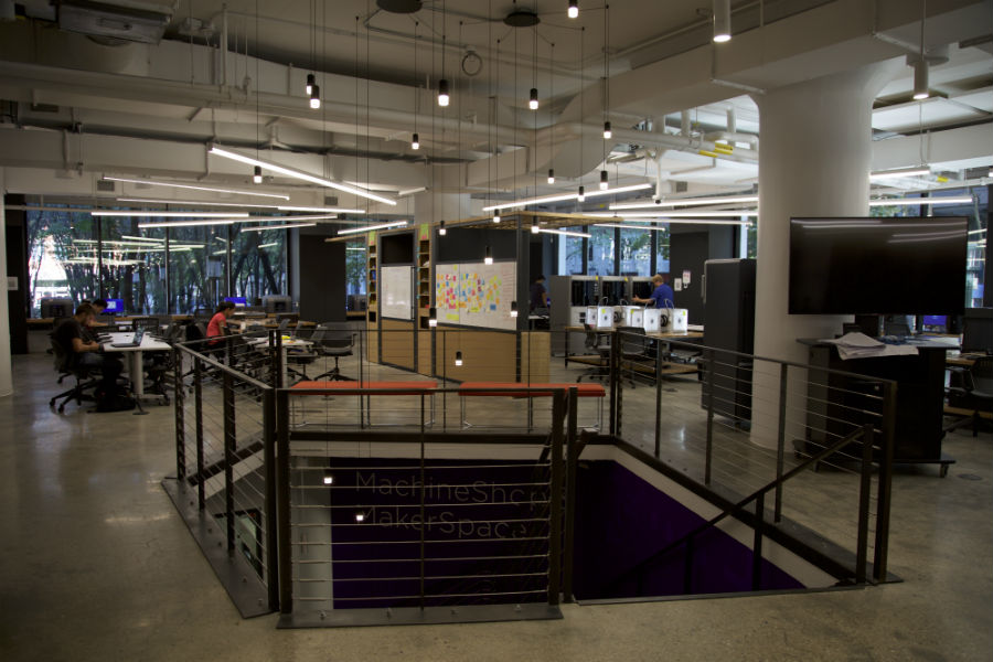
As the most recent creation from NYU Tandon school of Engineering, we are aiming to show everything that NYU Makerspace can offer in a visually attractive manner to encourage prospective students, parents and students in general to come to the facility located at Brooklyn.
In order to accomplish this, the website was created using the NYU style guide and incorporates interactive media such as videos and carousels. The website is presented in one page to make it easy for the user to navigate thorugh all the areas that the website has to offer and not miss any detail regarding MakerSpace.
Code Conventions
Naming Conventions
When it comes to coding, we prefer to use words-with-dashes. DO NOT write them using Camel case in order to keep the consistency of the code presentation. For example, when inserting an attribute to a link, do it this way:
---Avoid camelCase---
href="this-is-the-correct-way.html"
Attributes
Include the alt attribute for all images. Since we are targeting a very diverse group of people, we need to make sure that the Screen Readers can work with our websites nicely.
img alt="explain what the image is about" />
Directory Structure
The current files for this website are sorted as shown below:
- index.html
- style-guide.html
- js
- script.js
- css
- style.css
- img
- equipment
- 3d-printers
- cnc-machines
- electrical-and-computing
- laser-cutters
- MachineShop
- More
- icons
- 3d-printer-printing-letters.svg
- cnc_machines.svg
- facebook.svg
- industrial-robot.svg
- instagram.svg
- laser-machine.svg
- micellaneous.svg
- microchip.svg
- snapchat.svg
- vids
- intro.mov
- intro.mp4
- intro.ogv
- intro.webm
- whiteIntro.mov
- whiteIntro.mp4
- whiteIntro.ogv
- whiteIntro.webm
Typography
Font
MakerSpace's logo was made using Arial and Arial Black. The rest of the text was done using "Open Sans", sans-serif.
Sizes
Header 1 |
32px/40px |
Header 2 |
24px/30px |
Header 3 |
18px/22px |
Header 4 |
16/18px |
|
Paragraph |
14/16px |
|
Subtle
|
12/14px |
Buttons
Colors
| Color | Hex | RGB | CMYK |
|---|---|---|---|
| White | #ffffff | 255, 255, 255 | 0, 0, 0, 0 |
| Darkgrey | #A9A9A9 | 169, 169, 169 | 0,0,0,34 |
| Black | #000000 | 0, 0, 0 | 0, 0, 0, 100 |
| Light Purple | #8901E1 | 137, 1, 255 | 39, 100, 0, 12 |
| NYU Violet | #57078E | 87,7,142 | 39, 95, 0, 44 |
| Blueberry | #140021 | 20,0,33 | 39, 100, 0, 87 |
Copy
The website should count with texts of short length. The messages have to be concise, straightforward and clear.
Since this website aims to display more images rather than giving full information of the place (such information is provided in another website), its best to explain things by showing them rather than buying them so avoid text if possible.
Images videos
The images have to be all 900px wide and 600px long in order to keep consistency along the carousels


Layouts and Grids
The website used Bootstrap's framework and grid system. The body is container-fluid to avoid whte margins.
The page is divided in sections labeled with colors and titles, and a navbar that keeps track of where the user is.
MakerSpace's website uses a mobile-first approach
For more information refer to the wireframes.